A Map Is Not a Picture. It's a Decision About What Reality Is.
Why Every Map Is Wrong, And What Comes Next. Earth isn't flat or round, it's dynamic. A 1690 Vatican map, Buckminster Fuller, and new cartographic mathematics reveal what every standard map gets wrong.

A new frame, drawn from an old map and a living Earth.
Author: Nicole Flynn
Institution: Symfield PBC
Date: Feb, 2026
Publication Record: This document has been cryptographically timestamped and recorded on blockchain to establish immutable proof of authorship and publication date.
Most maps share an assumption so foundational it stopped being visible centuries ago: that Earth is a fixed object waiting to be accurately represented. The cartographer stands outside, measures, projects, and hands you a picture. The picture is either faithful or distorted. The debate, when there is one, is only ever about which distortion to accept.
There is a map dated 1690, held in the Vatican, that quietly refuses this premise. It centers on the North Pole. It marks uncertainty in red rather than erasing it. It includes a geometric instrument for reading its own mathematics. It was built around a different question entirely, and that question turns out to be the right one.
The Debate We've Been Having Is the Wrong Debate
Flat Earth. Round Earth. The argument has consumed enormous energy, generated enormous heat, and almost entirely missed the point. Earth is an oblate spheroid. The evidence is overwhelming and the measurement is precise, we've confirmed this from orbit, from geodesy, from physics. That part isn't the question. The question is whether spheroid is a sufficient description of something that also deforms in real time, wanders at its poles, redistributes mass as ice melts, and breathes in ways GRACE-FO satellites now measure directly.
Both sides are arguing about the shape of the container. Neither is questioning whether a container is the right way to think about it at all.The real question isn't the shape. It's whether shape alone is a sufficient description. Earth is an oblate spheroid that deforms. Its poles wander. Its gravity field shifts. Its mass redistributes as ice melts and groundwater moves. GRACE-FO satellites measure this in real time, not as anomalies, but as the normal behavior of a dynamic system. The sphere isn't wrong. It's just a snapshot of something that doesn't hold still.
This is where every map projection, including the most mathematically sophisticated ones, quietly makes a choice that goes unexamined: it treats the snapshot as the thing itself. Every standard map, flat or globe, shares a foundational assumption so deep it became invisible, that Earth is a static object to be accurately represented. The cartographer stands outside, measures, projects, and hands you a picture. The picture is either faithful or distorted. The goal is fidelity to a fixed thing.
But what if the thing isn't fixed?
What the 1690 Map Knew That We Forgot
The Vatican map does something quietly radical. It centers the Arctic, not as empty space at the top of a Mercator projection, but as a hub. A connector. The place from which everything else radiates.
This turns out to be geographically honest in ways we're only now re-appreciating. The Arctic is the only place on Earth where geopolitical competition essentially stops, where nations that agree on nothing else maintain shared treaties. The same is true of the Antarctic. And the Moon.
There is something about poles and orbital bodies that forces a different kind of relationship. The 1690 cartographer may not have known why. But the geometry knew.
The map also does something else, it marks uncertainty in red. It draws landmasses it cannot confirm, phantom coastlines, speculative continents, and it draws them anyway, flagged as unknown but present. This is not a failure of accuracy. It is an act of epistemic honesty that modern cartography largely abandoned when it decided that only confirmed data deserves representation.
Those red landmasses were not wrong. Some of them were coasts exposed during lower sea levels, real land that drowned when the last glacial maximum ended 12,000 years ago. Some may be accurate memory transmitted through cartographic tradition from before recorded history. Doggerland, the substantial landmass between Britain and Denmark now under the North Sea, is confirmed. We pull up its tools in fishing nets. It was real. It just isn't above water anymore.
The 1690 cartographer drew the edge of knowledge and kept going. That is not bad science. That is the only honest move when you sense something real that your instruments can't yet confirm.
A Map Is a Mathematical Decision
Here is the thing Buckminster Fuller understood that most cartographers didn't want to hear: the mathematics you choose shapes the reality you can perceive.
The Mercator projection wasn't neutral. It was designed for colonial navigation, for finding angles, not for understanding relative size or relational truth. It made Greenland look as large as Africa. It put Europe at the center. It built those assumptions so deeply into the visual language of maps that generations of people absorbed them as facts about the world rather than choices made by a cartographer serving a particular purpose.
Fuller's Dymaxion projection unfolds Earth onto an icosahedron with all vertices in the oceans, so no continent is interrupted. The result has no privileged center, no top or bottom, minimal distortion across all landmasses simultaneously. It shows Earth as what it actually is: one island in one ocean.
It was dismissed by the cartographic establishment for decades. It is now recognized as foundational.
The pattern repeats. Milankovitch spent decades calculating how Earth's orbital variations drive ice ages, by hand, largely alone. The establishment found it implausible that subtle orbital shifts could drive planetary-scale climate reorganization. He died without full vindication. The data confirmed him 18 years later.
Both men saw that the existing mathematical containers were inadequate to the systems they were applied to. Both built new containers rather than accepting the limitation of the old ones.
The Most Honest Book That Never Asked the Right Question
There is a book called Map Projections: A Reference Manual by Lev M. Bugayevsky and John P. Snyder. If you want to understand projection mathematics at its most rigorous and complete, this is the book. Snyder spent his career at the USGS producing some of the most precise projection work ever done. Bugayevsky brought the depth of the Soviet cartographic tradition. Together they produced something genuinely authoritative.

Figure: Map Projections: A Reference Manual, Bugayevsky and Snyder (1995). Read this book. It is genuinely excellent at what it does. Then notice what it never once asks. That gap is where this work begins.
Read it expecting it to address Earth as a dynamic system and you will find it magnificently, rigorously, completely inadequate for that purpose.
Snyder's own introduction "It was established at an early date that attempts to prepare a flat map of a surface curving in all directions leads to distortion of one form or another." Google Books
That is the foundational admission the entire tradition rests on. Every equation in both books flows from that single sentence. Distortion is accepted as inevitable from page one, and from that point forward the only question ever asked is how to manage it. Not whether the surface itself is dynamic. Not whether the act of projection collapses something essential. Just which distortion to accept. Not because it is wrong. Because it is exactly right about everything it assumes, and the assumption is never questioned. Every chapter, every equation, every carefully derived formula operates on the same foundational premise, a fixed sphere being projected onto a flat plane. The entire mathematical apparatus is devoted to managing distortion in that translation; which distortion to accept. Which properties to preserve and which to sacrifice.
The sophistication is real. The blind spot is total. Snyder had access to every geodetic measurement of Earth's actual dynamic behavior. The data showing Earth deforms, responds to gravitational strain, shifts mass, breathes, that data existed. It simply lived in a completely separate conversation from the projection mathematics. Two traditions. Same planet. Never speaking to each other. This is what happens when a foundational assumption becomes invisible, it stops being a choice and starts being the air the mathematics breathes. Nobody in the projection tradition was being careless. They were being extraordinarily careful, inside a container whose walls they could no longer see. The work itself is beautiful, I own this book and it is definitely worth your traversal.
Bugayevsky and Snyder open by establishing that mathematical cartography's power rests on "a one-to-one correspondence of elements of nature and society and their representation on the map." This is the foundational claim of the entire tradition: that nature has fixed positions which mathematics can faithfully capture. Every projection equation, every distortion analysis, every computational method in the book flows from that single assumption. Symfield's cartographic mathematics begins exactly where that assumption ends. at the question of what happens when nature doesn't hold still.
Consider the beginning of the Introduction Map Projections: A Reference Manual, Bugayevsky and Snyder (1995), below:
The successful solution to many problems related to commerce and science is based on a wide use of maps of various scales, contents, and purposes.
Maps have a number of features and advantages. Amon g them is a one-to-one correspondence of elements of nature and society and their representation on the map. Maps serve as a basis for measuring and obtaining various qualitative and quantitative characteristics necessary for solving scientific and commercial problems. Maps have highly important informational and cognitive properties. They can be used for objective investigation into specific problems i n various fields of economics and science (navigation, land use and forest organization, organization of private and governmental facilities, etc.).
The capacity to solve these problems is based on the fact that positions on maps can be determined on a strictly mathematical basis, the study and elaboration of which is the subject of mathematical cartography. Mathematical cartography deals wit h the theory of map projections, map scales and their variation, the division of maps into sets of sheets, and nomenclature, as well as wit h problems of making measurements and carrying out the investigation of various phenomena from maps. Mathematical cartography also includes the study of map projections which make use of geodetic measurements and the development of graphical methods for solving problems of spherical trigonometry and astronomy, marine navigation and aeronavigation, and even crystallography. It is also the basis for developing the theory of methods and techniques for map design. The main objectives of mathematical cartography are
The main objectives of mathematical cartography are
• the development of the theory, and, above all, workin g out new methods of research on map projections, including the 'best 9 and 'ideal' ones;
• research into various map projections, their nature, properties, and capacity for practical application;
• improvement of the available map projections, their unification and standardization ; development of new map projections satisfying the requirements of science and industry for the compilation of various maps, including thematic and special maps, as well as the processing of geodetic measurements and the solution of geodetic and applied engineering problems;
• developing and using the algorithm and program for a given map projection, and incorporating these and subsequent improvements of computational techniques into computer software libraries;
• development of other mathematical elements of maps (determination of scale variation and the design of maps, and division into sheets according to map purpose, contents, and other preset requirements);
• development of methods and means for performing various measurements from xiii xiv Map projections: a reference manual maps, considering the map projection properties and including methods of reading computerized cartographic information;
• research on and solutions to problems of mathematical map design (e.g. methods of map projection transformation using various equipment including computers wit h peripherals; methods of making map graticules on automated and nonautomated coordinatographs);
• development of technical aids to take measurements from maps;
• development of the theory and methods of automation i n mathematical cartography.
The main element of a map's mathematical basis is a map projection. Its properties influence the choice of the nomina l scale and design of the map, and in tur n determine a close interrelationship of all the map elements. This book is devoted to this main element, and hence to mathematical cartography, i.e. the theory of map projections. A brief history of the development of map project.
The authors list the main objectives of mathematical cartography across fourteen points, covering theory, research, algorithms, automation, measurement, and computational methods. It is an exhaustive and genuinely ambitious framework. Earth does not appear in any objective as a dynamic system. This is not a criticism of the book. It is a description of where an entire field placed its boundaries, and where a new field begins.
Fuller saw the walls.

Figure: Also know as the “Dymaxion Map,” the Fuller Projection Map is the only flat map of the entire surface of the Earth which reveals our planet as one island in one ocean, without any visually obvious distortion of the relative shapes and sizes of the land areas, and without splitting any continents.
What made Fuller different wasn't just that he produced a better projection. It was that he stepped back far enough to ask what the projection was actually for, who it served, what it made visible, what it made impossible to see. He recognized that the Mercator map wasn't just technically imprecise. It was philosophically dishonest. It encoded separation. It assigned hierarchy through geometry. It made certain lands look larger and more significant. It split oceans into margins and put them at the edges where they couldn't show their connective function. And it did this so consistently, for so long, that the distortion became invisible, absorbed as fact rather than recognized as choice.
Fuller didn't try to make Mercator slightly less wrong. He didn't dig the existing hole deeper. He questioned why the hole was being dug at all, and built from his own honest perception of what Earth actually is.
His answer: "The only flat map of the entire surface of the Earth which reveals our planet as one island in one ocean, without any visually obvious distortion of the relative shapes and sizes of the land areas, and without splitting any continents."
One island. One ocean. No false centers. No hierarchy encoded in the geometry. No continents interrupted for the convenience of the projection. Traditional world maps, Fuller understood, "reinforce the elements that separate humanity and fail to highlight the patterns and relationships" that are actually there. They actively prevent certain kinds of seeing. A map was supposed to be, in his words, "a precise means for seeing the world from the dynamic, cosmic and comprehensive viewpoint." The tradition had drifted very far from that.
The cartographic establishment dismissed the Dymaxion for decades as interesting but impractical. It is now recognized as foundational.
The lesson isn't that Fuller was smarter than Snyder. It's that they were asking entirely different questions.
- Snyder asked: Given that we must project a sphere onto a plane, how do we do it with maximum mathematical precision?
- Fuller asked: What is Earth, and how do we show that honestly? Only one of those questions could produce something genuinely new.
"Everything you've learned in school as 'obvious' becomes less and less obvious as you begin to study the universe. For example, there are no solids in the universe. There's not even a suggestion of a solid. There are no absolute continuums. There are no surfaces. There are no straight lines." R. Buckminster Fuller
Earth Is Not a Picture. It's a Process.
Here is the frame that changes everything, and may change you.
A map built on collapse-based mathematics, where complex states are reduced to single values, where uncertainty is eliminated rather than preserved, where the system is captured at a moment rather than followed through time, can only show you a static representation. Projection math is complete within its boundary conditions, but those boundary conditions exclude dynamical field states. It shows you Earth as it was when the measurement was taken, flattened into a representation that discards everything dynamic, everything breathing, everything in transition. But Earth is not static. It never was.
- Sea levels 12,000 years ago were 120 meters lower than today.
- Entire continental shelves were exposed. The Bering land bridge was a grassland.
- The North Sea didn't exist. The Persian Gulf was dry land.
- Coastlines that supported human populations are now under water and we are only beginning to find the evidence, in the form of tools pulled up by fishing nets, submerged architectural features, underwater archaeological sites that force a rethinking of where civilization began and how it spread.
- Earth's axial tilt oscillates.
- Its orbital eccentricity varies.
- Its poles wander.
- Its magnetic field reverses.
- Its shape, not metaphorically, literally, deforms in response to gravitational strain, mass redistribution from melting ice, the movement of water weight across its surface. GRACE-FO satellites measure this directly.
Our planet breathes! Its semi-axes change. It leans. And any map that doesn't account for this isn't inaccurate. It's a category error. It's a photograph of a river and a claim that it captures the water.
What a Map Could Be, Why Every Map Is Wrong, And What Comes Next.
If we let go of the flat-versus-round debate, which is really a debate about which static container is less wrong, we can ask a different question:
What would a map look like if it treated Earth as a living, phase-coherent system?
Not a picture of a moment. A field representation, one that shows how Earth's systems are currently oriented, where coherence is stable and where it is shifting, how the planet is leaning based on accumulated strain, how information from its past is still active in its present. Not collapsing uncertainty into false precision. Preserving it, the way the 1690 Vatican cartographer preserved it, in red, at the edges of what was known, marking the boundary between confirmed and sensed without discarding either.
Such a map would need new mathematics. Mathematics that doesn't force closure on open systems. That maintains the full distribution of possibility rather than reducing it to a point estimate. That tracks how field memory decays over time rather than treating the present as discontinuous from the past. That mathematics is being built now.
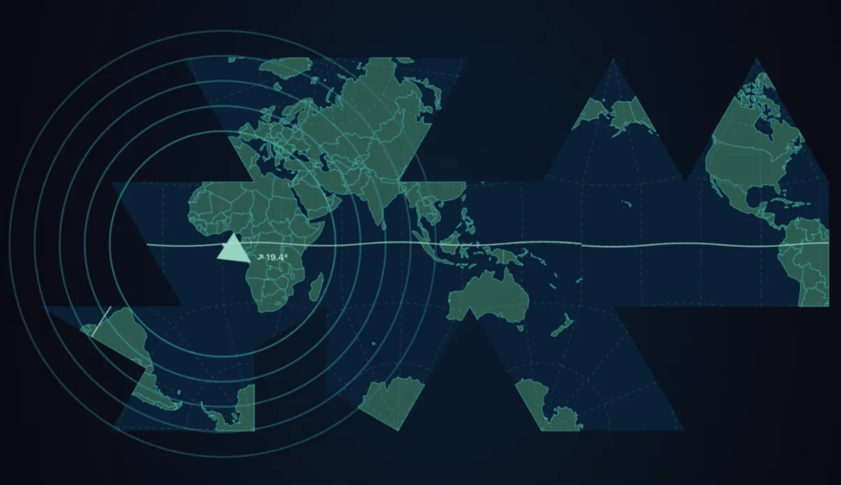
Figure: Symfield Dymaxion Projection, Fuller's authentic icosahedral unfolding with live field-coherent overlays. True projection using d3.geoAirocean() (the standard D3.js implementation of Fuller's authentic Dymaxion projection), with the classic butterfly layout, all vertices in ocean per Fuller's original design. Enhanced with ⧖-field mesh, memory rings, and Schumann resonance visualization. Full explanation of terminology and mathematics here: https://www.symfield.ai/phase-coherent-earth-dashboard/
The Question the Old Map Was Really Asking
This map disorients you before it informs you. That is the point.
Rather than placing the equator at the center, the convention that would dominate cartography for centuries, this map centers on the North Pole. The world unfolds outward from the Arctic as a hub, continents radiating like petals around the place most maps treat as empty margin. It is a polar azimuthal projection, a technique with roots in Islamic mathematics, rare in European cartography of this period, and quietly radical in what it reveals. The UN flag uses one. It was never a fringe technique.
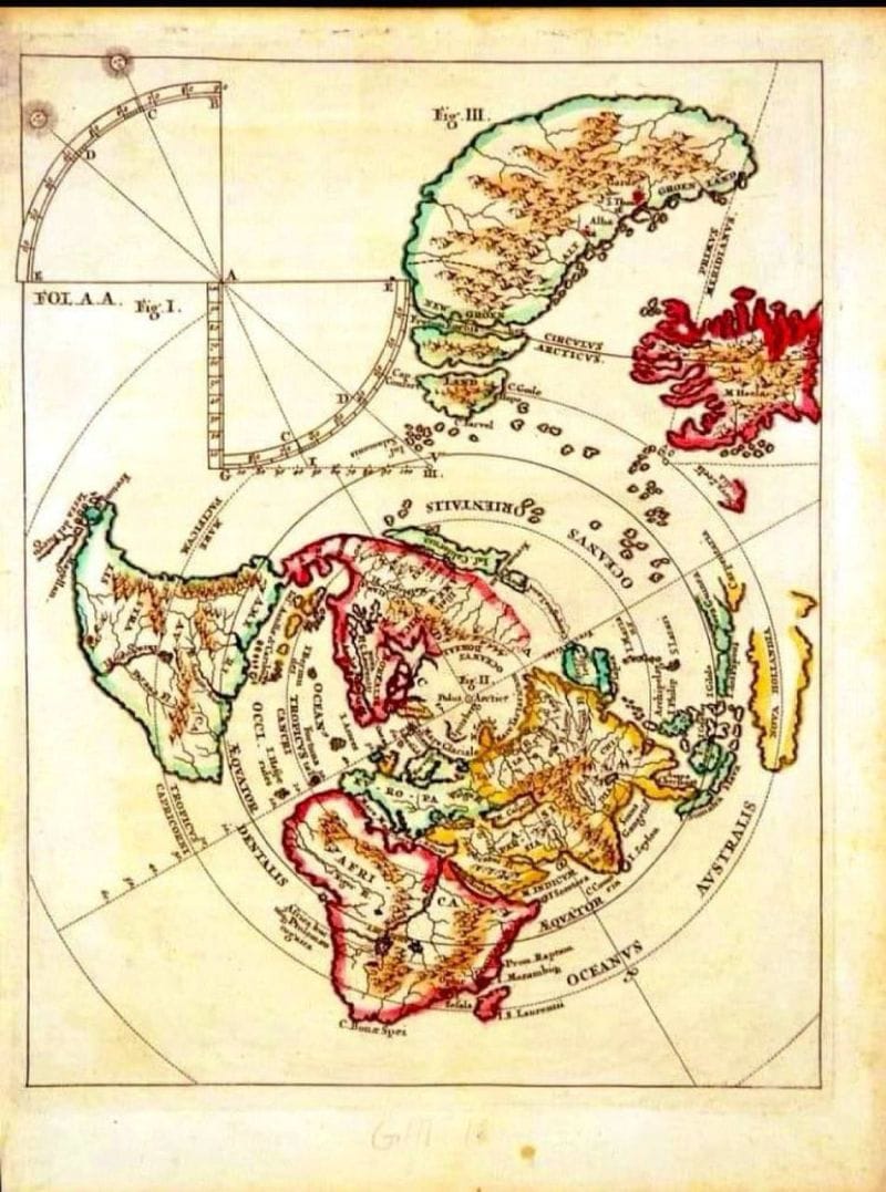
Figure: World Map, Polar Azimuthal Projection c. 1690 | Vatican Collection. This map is held in the Vatican collection. Cartographer unconfirmed. The polar azimuthal projection tradition it belongs to extends from al-Biruni (11th century) through Mercator's 1569 Arctic inset, and forward into Fuller's Dymaxion (1943) and contemporary field-coherent planetary visualization.
What you are looking at:
The large northern landmass labeled GROENLAND dominates the upper portion alongside what appears to be a second Arctic configuration, the map presents multiple geometric figures (labeled Fig. I, Fig. II, Fig. III) suggesting this is not simply a world map but a geometric instrument. The quadrant diagram in the upper left corner (FOL. A.A.) is a reading tool for the projection itself, the cartographer is showing you how to use the mathematics, not just the geography.
The concentric rings and radial lines are the projection's coordinate framework. Where a modern map uses a grid of latitudes and longitudes meeting at right angles, this system rotates outward from the pole in angular increments. Distance from center equals distance from the Arctic. The further the landmass from the center, the closer it is to the equator.
What the colors mean:
The warm ochres and greens represent confirmed, charted territory, Europe, Africa (AFRICA labeled clearly at bottom), Asia extending left, the early outlines of the Americas. The striking red landmasses in the upper right and scattered edges are something different entirely. These are speculative territories,coastlines reported but not confirmed, lands sensed at the edges of known navigation. The cartographer drew them anyway, in a distinct color, marking the boundary between knowledge and intuition without erasing either. This is not a failure of accuracy. It is an act of honesty that modern cartography largely abandoned.
What it knows that we forgot:
CIRCULUS ARCTICUS, the Arctic Circle is labeled prominently, and the Arctic itself functions here as connector rather than void. The polar center reveals something the equatorial Mercator projection actively conceals: that the northern landmasses of Europe, Asia, and North America are not separated by vast distance but arranged around a common hub. The Arctic is not the edge of the world. It is a meeting point.
AUSTRALIS appears on the right edge, an early notation of the southern continent, partially imagined, partially sensed from navigational accounts. HOLLANDIA marks Dutch territorial claims. The labeled ocean zones, OCEANUS ORIENTALIS, OCCIDENTALIS show a world still being named in real time.
What the geometry instrument tells us:
The quadrant in the upper left is not decorative. It is a tool for reading angular relationships in the projection for calculating where you are relative to the pole, and therefore relative to everything else. The cartographer understood that the map was a mathematical object as much as a geographic one. To read it honestly you needed to understand the geometry that produced it. This is a map that shows its work.
Why it matters now:
Every standard map projection assumes Earth is a static object to be faithfully represented. This one, centered on the pole, marked with uncertainty in red, equipped with its own geometric reading instrument was built around a different question: how do you show a dynamic, connected system honestly, from inside it, with the tools you have, while marking clearly what you do not yet know?
That remains the right question. We are only now building mathematics adequate to answer it. The Phase-Coherent Earth Monitor at symfield is one attempt at an answer, treating Earth not as a static object to be projected but as a dynamic system to be phase-aligned with. The mathematics are new. The question is old. The Vatican cartographer and Buckminster Fuller would recognize it immediately.
Disclosure: The mathematical formalism underlying the convergence hypothesis described in this paper is the subject of ongoing research and patent applications by Symfield PBC. Inquiries regarding the formal framework may be directed to the author.
© 2026 Nicole Flynn / Symfield PBC. All rights reserved.